Challenge
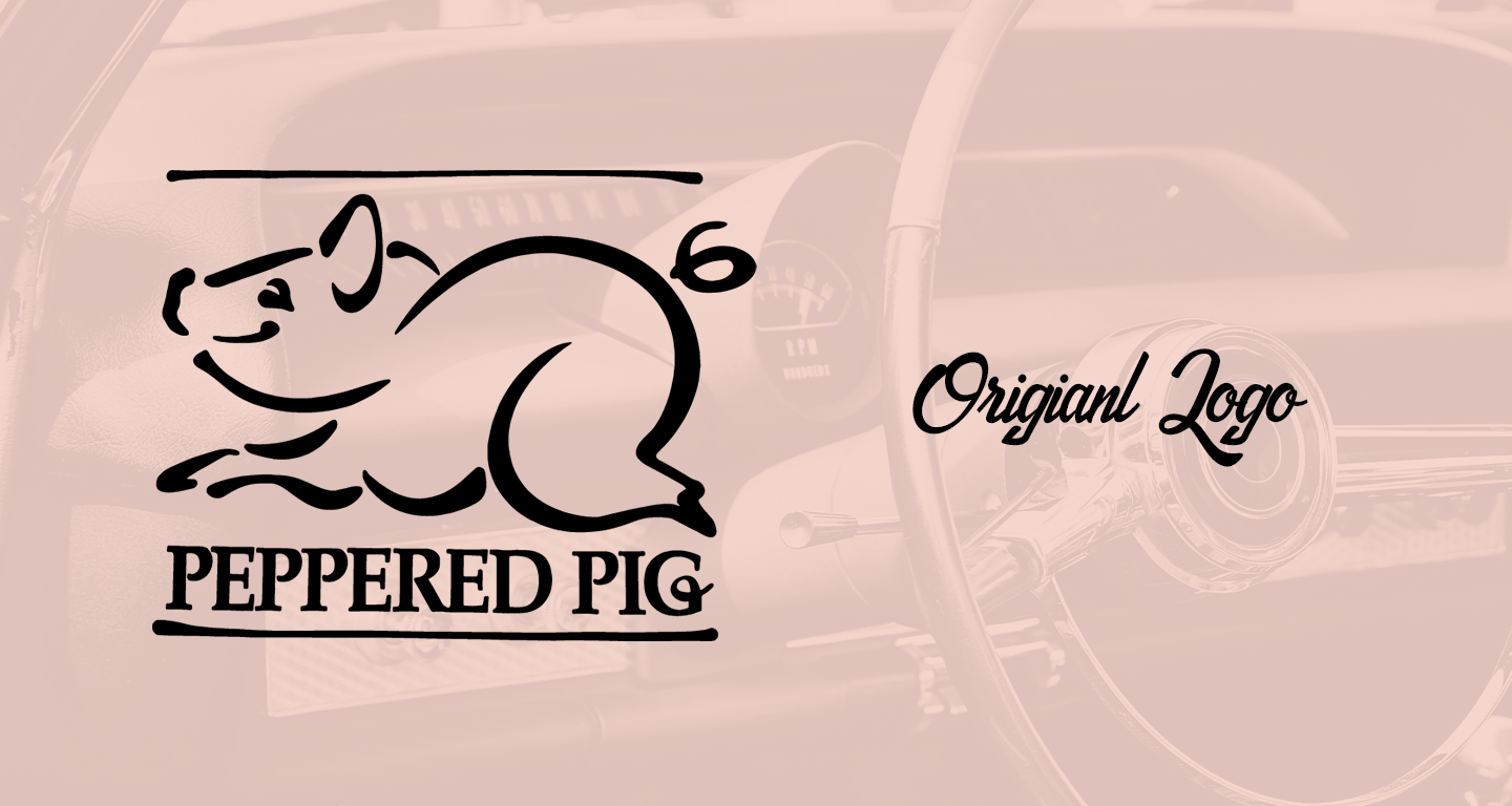
Rebranding for Brick and Mortar: The Peppered Pig began as a food truck, but when the owners moved to a brick-and-mortar location, they needed a fresh identity. Their previous logo often led patrons to mistakenly assume the restaurant specialized in BBQ, rather than its true focus—burgers. Wanting to be recognized as a classic Burger Joint, the owners aimed for a logo that captured the spirit of 1950s and 60s Americana diners, evoking memories of drive-ins, hot rods, and classic cars. One caveat was that they wanted to keep the “PIG” icon in some instances to honor the owner's late father, who created it.
Solution
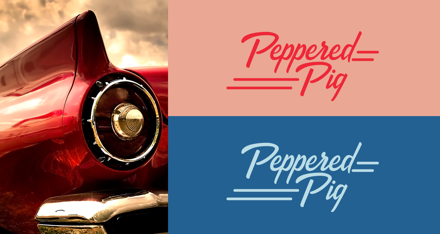
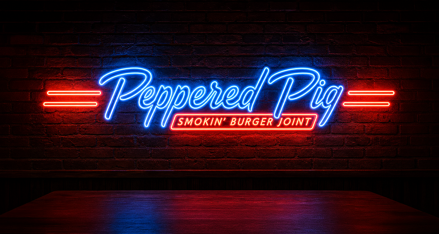
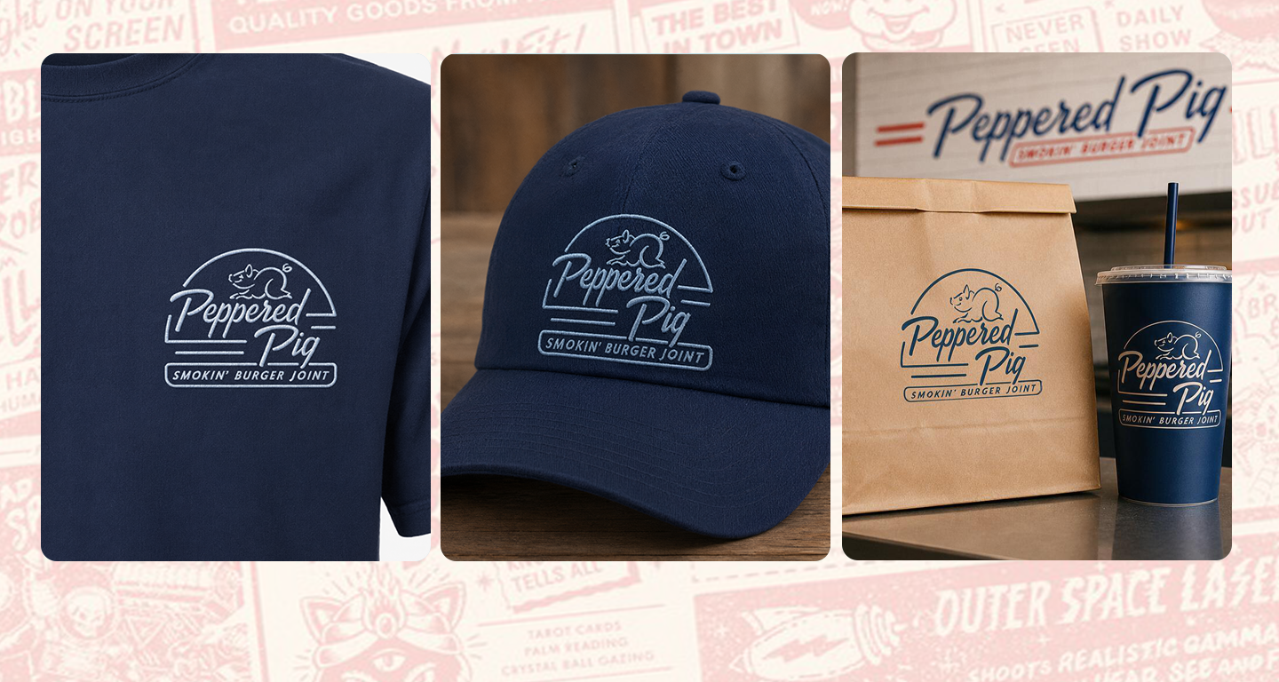
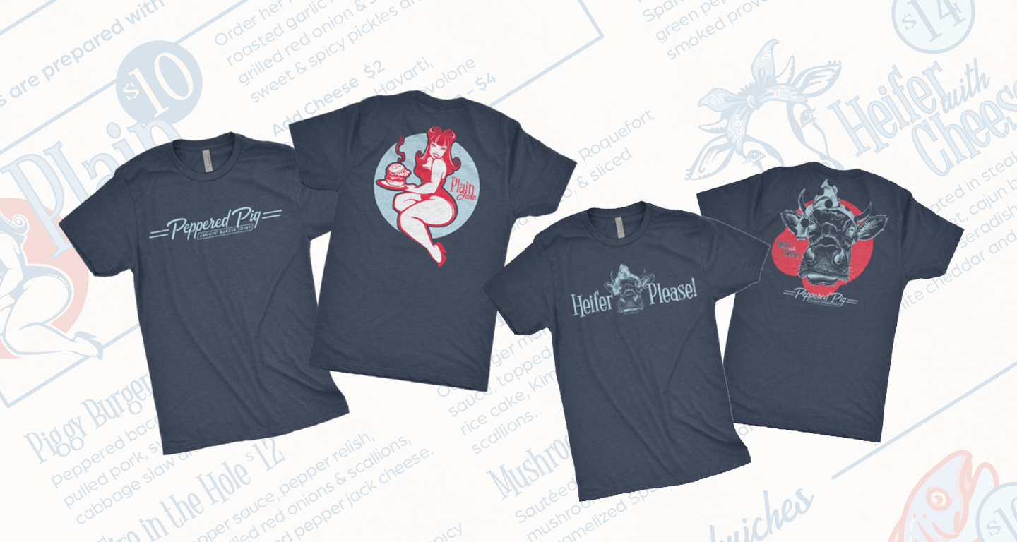
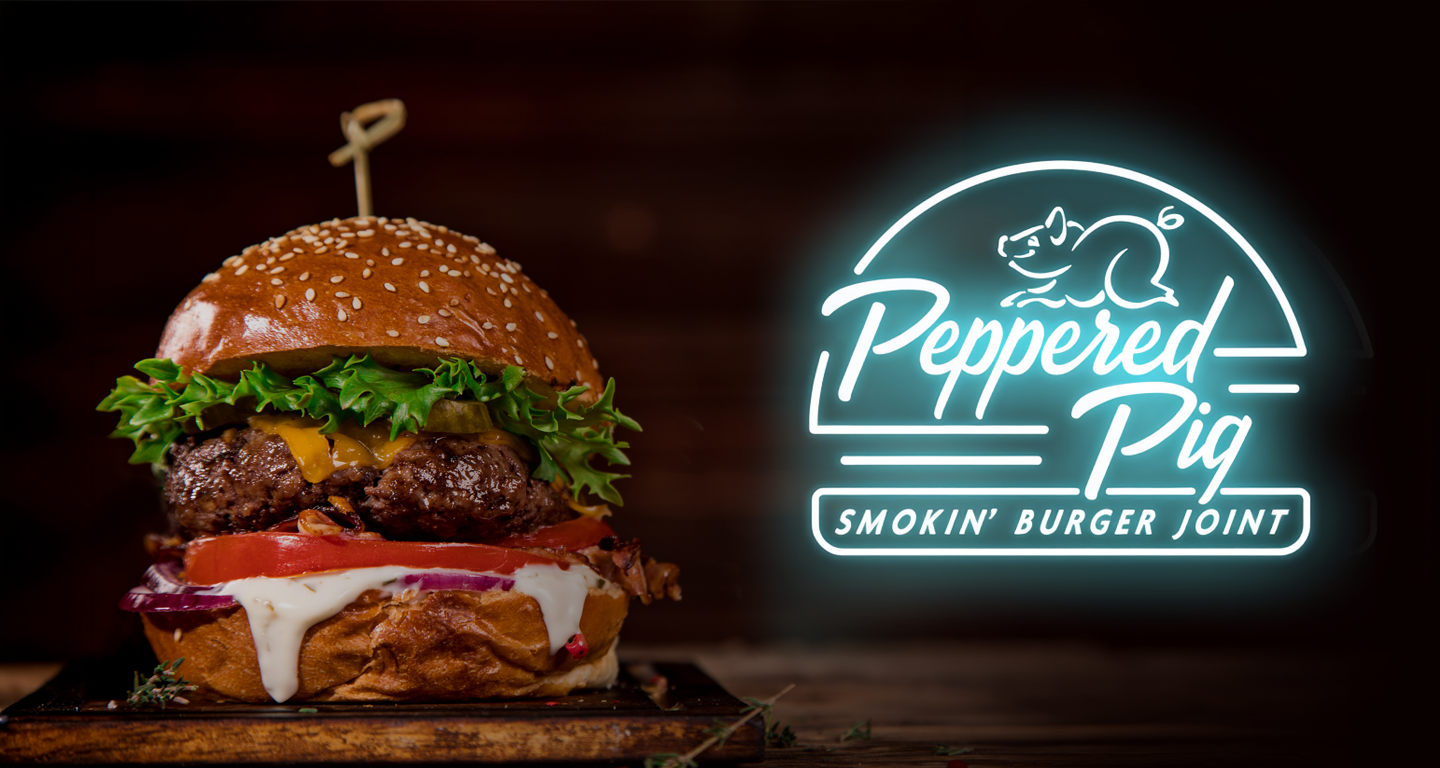
I crafted a logo drawing inspiration from classic car nameplates. Adaptable by design, the logo can be broken down into individual elements for various uses. The core logo brings together the wordmark and the “pig” icon, both set within a burger outline featuring smooth shapes and rounded corners, echoing the retro feel of neon signs. The wordmark channels the bold lines of vintage car emblems, and when paired with the neon motif, it powerfully embodies the Americana drive-in diner spirit. The pig icon is thoughtfully integrated to avoid any association with BBQ. This main logo version stands as the brand’s focal point and meets all of the client’s needs. By isolating the wordmark from the full logo, a streamlined horizontal version is created—ideal for signage or situations where a more compact, minimal appearance is necessary.