Challenge
Design a logo for a wakeboard cable park featuring a 2 Tower system. The logo should be simple, bold, and highly legible, as it will be applied to vinyl stickers for wakeboards, helmets, and various equipment. The key challenge is to create a design that not only clearly represents the park’s name but also visually conveys the dynamic motion and excitement of wakeboarding. Consider incorporating graphical elements that suggest speed, water, and the unique two-tower system to reinforce the park’s identity and appeal to wakeboarding enthusiasts.
A two-tower wakeboard cable park offers a cost-effective and accessible way for wakeboarders to enjoy their sport. Unlike expensive wakeboats—which require a significant investment in a boat, a truck to tow it, and the ongoing costs of fuel and maintenance—a cable park allows you to simply arrive and ride at your convenience. There’s no need to own a boat or coordinate with a driver and spotter. You can visit the park solo, ride for as long as you like, and leave without the burdens of boat ownership.
Compared to full-size cable systems, which use 5 to 7 towers arranged in a continuous loop, the two-tower system operates by moving the rider back and forth along a straight line, with a turnaround at each end. This setup creates a riding path that resembles an infinity symbol. Another key advantage of the two-tower system is reduced downtime after a fall. Instead of walking to shore and waiting for your next turn, the controller can simply bring the handle back to you, maximizing your ride time and enjoyment.
Solution
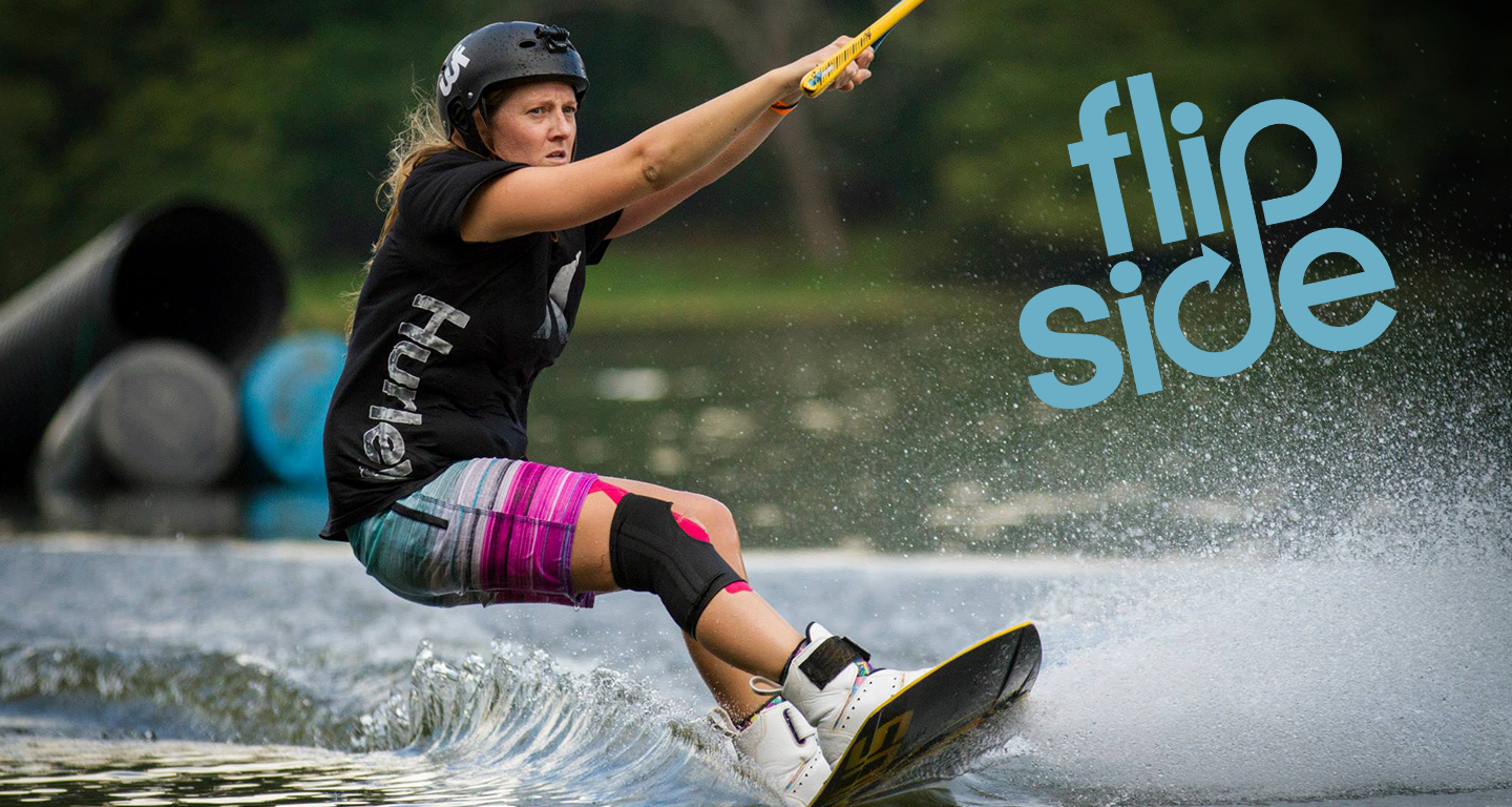
The final design is a bold, minimal wordmark that captures the feel of wakeboarding on a cable park system. The "P" in "flip" and the "D" in "side" are drawn to echo a rider's motion as they carve through the turn at each end of the cable pass. Together, the two letterforms also form an infinity symbol, a nod to the continuous, uninterrupted riding that a cable system makes possible, where riders loop the course without stopping for a boat to circle back.
The finished logo is clean and highly versatile. Its simple, high-contrast shapes hold up at small sizes and reproduce well across media, including stickers, apparel, decals, and digital applications.
Rider Passes
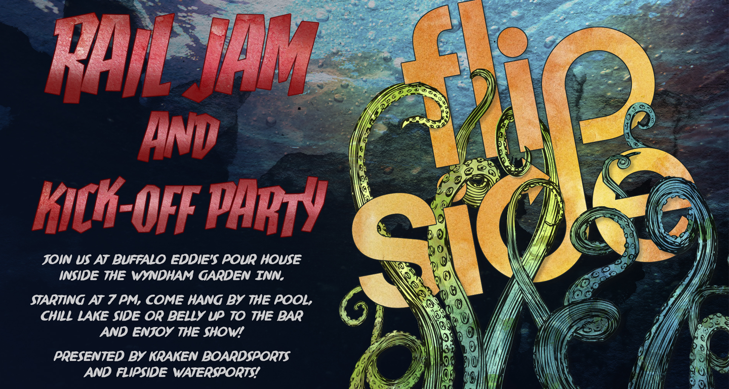
Each rider receives a credit card-sized pass to use the park. The card carries the logo alongside a graffiti-style background that expresses the park's raw, urban character. The setting is a tucked-away site within Alabama's largest city, and the street-art aesthetic ties the card to that edgy, industrial atmosphere. The familiar card format also keeps the pass practical to carry, scan, and keep on hand between sessions.
Main Building Signage
The sign for the main building identifies the hub of the park, which houses equipment rentals, rider sign-ups, the store front, and a snack counter. It carries through the raw, urban look established on the access passes, using the same street-art-inspired styling so that the first thing riders see on arrival matches the card in their hand. This keeps the park's identity consistent from the entrance to the pass to the building itself.
Color Approach
The logo was designed primarily for production as cut vinyl stickers, so no official brand color was assigned. Instead, color is determined by application. The stickers are cut in a range of standard vinyl colors, which lets riders choose a color that suits their gear, board, or vehicle and makes the stickers more appealing to them. Because the wordmark is a single solid shape, it stays legible and consistent in any of these colors.
Apparel
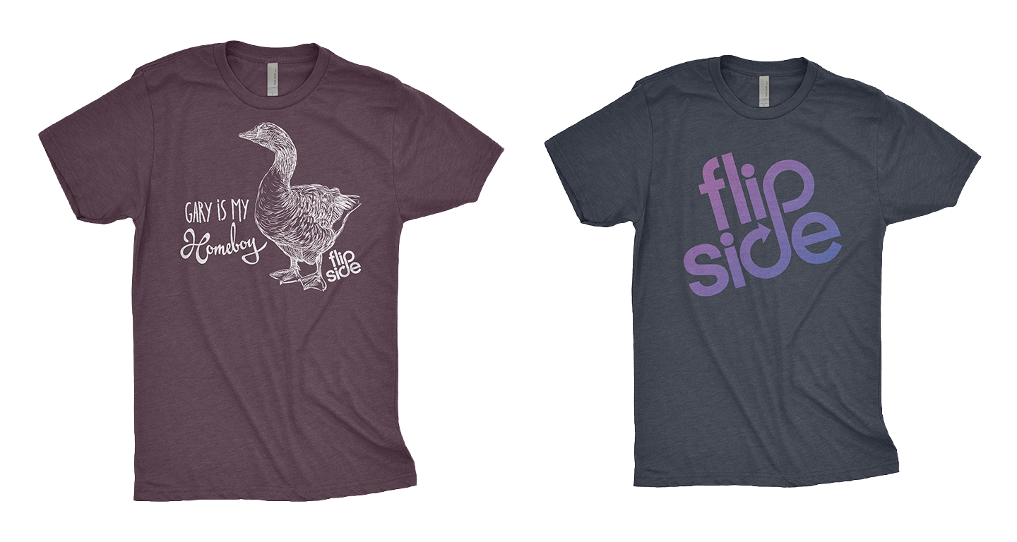
Two t-shirts were created for the park.
The first pays homage to a goose that became a familiar presence throughout the construction of the park. Friendly and approachable, he was named Gary by the employees. The shirt was designed as a thank-you and given to the employees and volunteers who helped get the park up and running, making it a keepsake of the effort and the community behind the opening.
The second shirt is a straightforward imprint of the logo. Because no official brand color was chosen, the park was free to pair the logo color with the shirt color, choosing combinations that work well together and suit the park's look. These were sold in the store to the park's patrons.